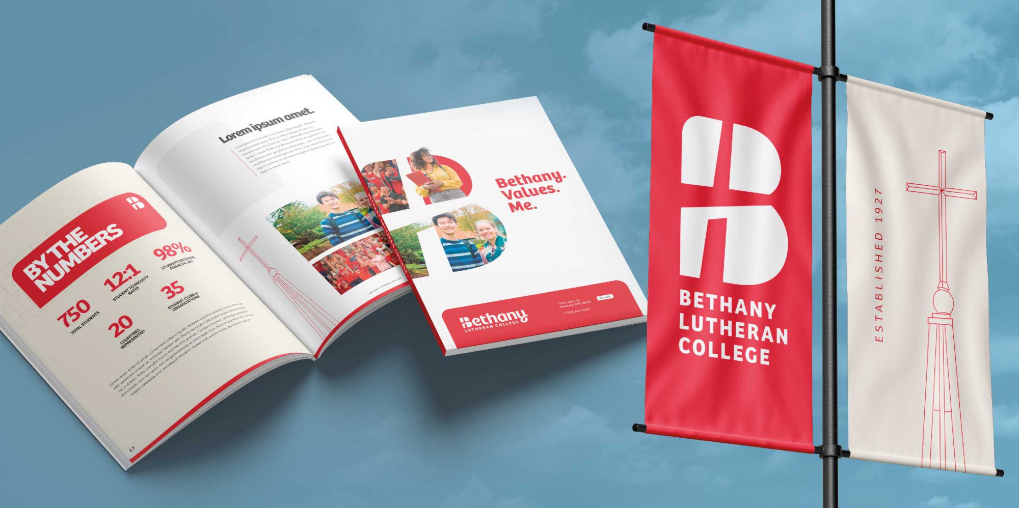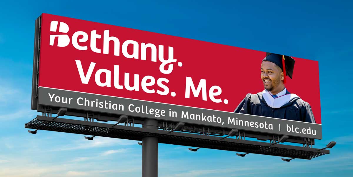
The new Bethany corporate logo.
From Bethany Magazine, Spring/Summer 2024
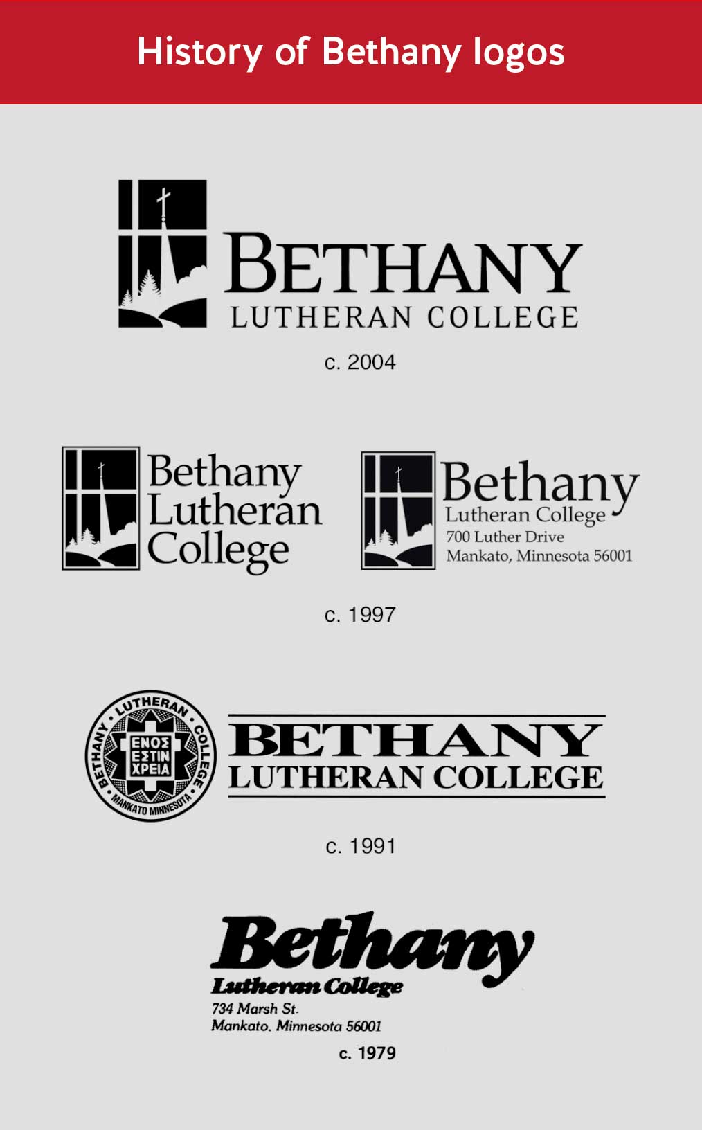
With this issue of the Bethany Magazine, we’re debuting a new institutional logo. Bethany’s current logo has been in use since 1997, and for several years, the College has been exploring concepts for a new logo.
Bethany’s current, familiar logo tells an intricate story that is personal to our history and mission. The design includes a picturesque setting on the hilltop where a chapel stands boldly in the context of a Norwegian flag. But, because of the current logo’s very detailed design, it’s proven to be not very adaptable for practical applications in certain situations.
The primary purpose of a logo is to easily identify. All one needs to do is think of logos from large, worldwide companies and you’ll understand the idea of being a quick identifier.
Throughout a multi-year process, hundreds of directions and variations of a new Bethany logo were considered with input from students, alumni, professional designers, and Lutheran artists from various fields. Bethany students, beginning already five years ago in 2019, helped develop the concepts around the new look.
During the design process, Bethany’s students and Alumni Board met to discuss what needed to be included with a new logo and quickly determined that the College’s identity must be carried in written and verbal form as “Bethany.”
It was also understood by all involved with the process to create the new logo that the updated version might not be able to tell such a detailed and personal story as the former logo and still remain simple and recognizable. A useful logo needs to be easily understood and quickly remembered.
In the end, the design of the new Bethany logo was focused on simplicity and clarity along with these core concepts:
1. A Cross is prominent and instantly identifies Bethany as a Christ-centered organization.
2. The Lutheran name is boldly represented in a distinguishing manner.
3. An overall contemporary feel embodies the spirit of a youthful organization mixed with rich historical elements while the Cross nods to previous logos.
4. The “B” at the start and “y” at the end were crafted to draw the
eye forward and to what’s next in the continuation of growth and progress through our mission in “The One Thing Needful.”
In coming months you’ll begin to see the new logo in various Bethany applications, but in order to make the change in a cost neutral fashion, the new Bethany logo will be gradually phased into use over the next couple of years. Letterhead and other items will transition to the new logo after old supplies are exhausted.
Halvar, the Bethany Viking mascot (and associated athletic logos) and the timeless college seal with the Greek “One Thing is Needful” will remain as cherished identifiers of Bethany. This is in keeping with a standard practice for colleges to have a mascot, an official seal, and a professional institutional logo for business and marketing purposes.


